Eataly Caffe
Project Overview:
Project Overview:
Visual Design Case Study
A 360 campaign and digital experience designed to make gifting effortless, personal, and meaningful-driving more customers to choose Eataly Gift Cards this holiday season.
Goal: Drive Engagement and Increase Discoverability
Role: Visual Designer | Designed the end-to-end campaign & experience
Timeline: 3 months
Design Elements: Layout, Illustrations, Color, Imagery, Interactivity, and Typography.
Tools: Figma, Photoshop, Illustrator
About Eataly Caffe
Drawing inspiration from Italy's renowned coffee bar culture, Eataly Caffè offers a vibrant experience with a menu featuring expertly crafted espresso drinks, freshly baked pastries, indulgent gelato, and savory delights like
Roman-style pizza alla pala.
The space also includes a thoughtfully curated retail section, showcasing premium products from
Eataly's exclusive Icons line.
Understanding the User
User Research
Personas
Problem Statement
Competitive audit
Ideation
User Research
Summary
I analyzed the research and began developing interview questions for user interviews with students from University of California Los Angeles (UCLA). I assumed most interview participants reported feeling stressed about experiencing financial matters stemming from the fear of being unable to meet tuition costs and monthly expenses.
I also assumed that students were embarrassed to seek help. However, the feedback from my research made it clear that students would be open and willing to work towards meeting their financial goals if they had an easy-to-use, affordable, and accessible tool to help guide them.
Personas
Problem statement - Liam is a working student who needs a solution that will allow him to receive funding outside of student loans because they typically stress out and can't concentrate on school when they don't have enough money to pay for school-related expenses.
Competitive audit
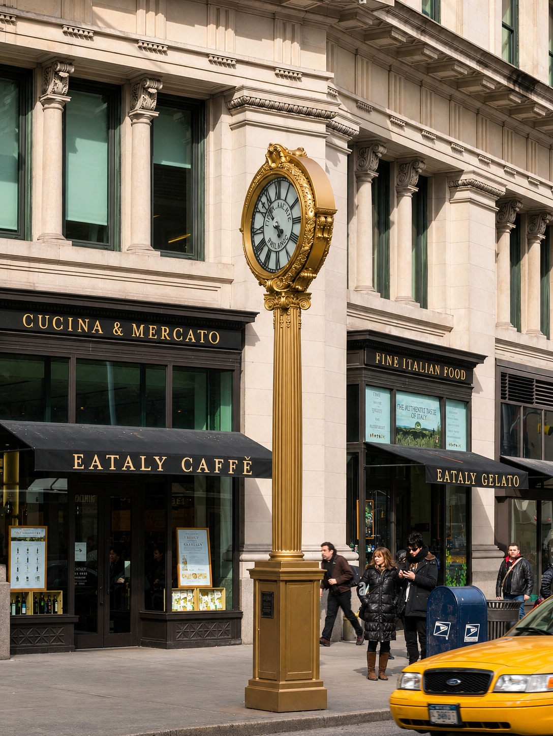
Starbucks, Blue Bottle Coffee, Blank Street Coffee
Ideation
I did a quick ideation exercise to come up with ideas for how to address gaps identified in the competitive audit. My focus was on creating simple features that allow users to search, donate, and comment.
Sitemap
I did a quick ideation exercise to come up with ideas for how to address gaps identified in the competitive audit. My focus was on creating simple features that allow users to search, donate, and comment.
Sitemap
I did a quick ideation exercise to come up with ideas for how to address gaps identified in the competitive audit. My focus was on creating simple features that allow users to search, donate, and comment.
Digital Designs
I did a quick ideation exercise to come up with ideas for how to address gaps identified in the competitive audit. My focus was on creating simple features that allow users to search, donate, and comment.
Low-fidelity prototype
I did a quick ideation exercise to come up with ideas for how to address gaps identified in the competitive audit. My focus was on creating simple features that allow users to search, donate, and comment.
Usability Study
Study type Unmoderated usability study
Location California State University, Los Angeles - CSULA
Participants 7 participants
Length 30-60 minutes
Key Performance Indicators (KPIs)
I considered a few KPIs that can be used to evaluate the success of the Collegefund’s mobile app:
Daily Active Users: The number of unique users who accessed the app each day.
Orders per Day: The number of donations made through the app each day.
Customer Satisfaction: A measure of how satisfied users are with the app, typically collected through user surveys.
Going Forward
Takeaways
Next steps
Findings
After I conducted two rounds of usability studies, I used the findings from the first study to improve the designs. While conducting the second study, I created a high-fidelity prototype, and it revealed what aspects of the mockup needed refining.
Round 1 findings
1. Search People want to connect with students who need help, not just locally.
2. Privacy Users wanted an option to donate anonymously.
3. Misconduct People wanted a way to report a fundraiser in the event something wasn’t right.
Refining The Design
Mockups
High-fidelity prototype
Accessibility
Key Performance Indicators (KPIs)
Mockups
Based on the insights from the usability studies, I applied design changes like adding a "donate anonymously" button that will allow users to donate without displaying their name publicly on the student's campaign.
Design System:
The high-fidelity prototype followed the same user flow as the low-fidelity prototype, including design changes made after the usability study.
View on:
High-Fidelity Prototype
The high-fidelity prototype followed the same user flow as the low-fidelity prototype, including design changes made after the usability study.
View on:
Accessibility
Considerations
Text is accessible and readable for visually impaired users who have difficulty reading dense blocks of text.
Clear labels for interactive elements.
The initial focus of the home screen is automatically personalized recommendations and helps users effortlessly define the primary task.
Takeaways
Impact Users shared that the app made fundraising easier and more accessible.
One quote from peer feedback "Collegefund app is innovative and easy to use. The platform helps bring awareness to the needs of many students who need financial help because they struggle to meet their basic needs, impacting their ability to succeed in school."
What I learned This experience taught me that despite the scale of the problem I was addressing, following each step of the design process enabled me to approach the problem with the user's needs in mind and generate innovative solutions.
35%